Complete website setup
Before you start
Begin with HubSpot CMS tutorial.
-
This tutorial will show you the step-by-step process you need to follow to start and launch a website with the GrowBig theme.
Copy and paste this URL https://youtu.be/j0NwSb_X594 into your browser as links are not clickable in the HubSpot page editor.
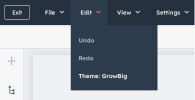
Go to the theme settings if you are not already there.
-
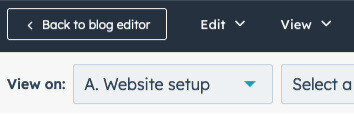
Navigate to the theme settings in the top left corner and select "Edit" -> "Theme: Growbig" to access the theme settings.
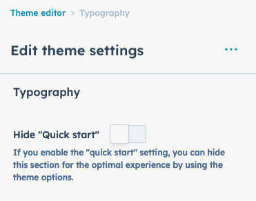
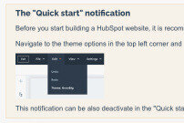
Deactivate the "Guide notification."
-
The purpose of this notification is to help find the "quick start" website setup.
Deactivating this notification is possible in the primary "quick start" theme settings.
What is the result of using the "Quick start" website setup?
- Allowing you to preview how your website will look before you start building it.
- Avoid wasting your time customizing unfamiliar theme options and modules to determine if the “GrowBig” theme is the right choice for you.
Do's
- Follow the “Quick start” step-by-step.
- Please prepare your design assets, such as the branding guidelines, current website styles, or any other available materials.
Do nots
- Skipping steps in the website setup.
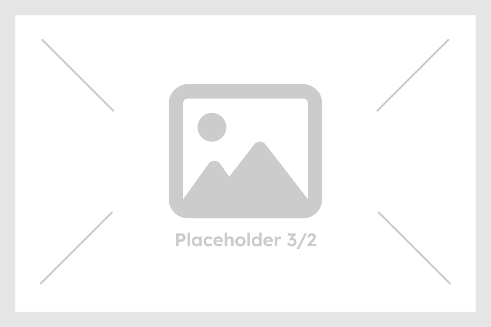
- Instead of adding images that doesn't match the recommendation, it is recommended to use placeholders.
- Do not use primary theme options until you have completed the "Quick start" website setup.
The following design assets are needed
- Branding guidelines or current website: Define your typography, colors, and design concept.
- Logos: one for a light background and one for a dark background.
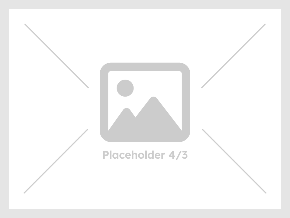
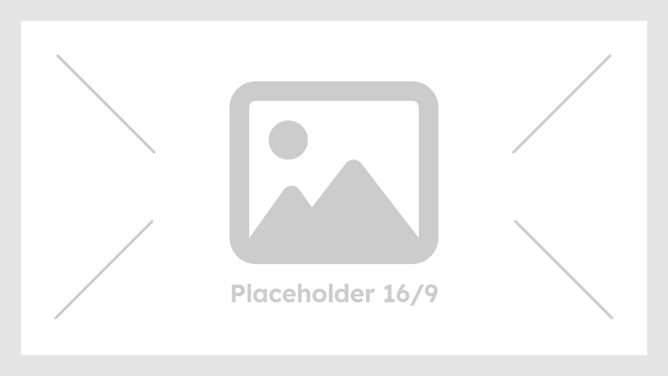
- The setup requires 5 images: 1:1 ratio image with a max width of 800px, 4:3 ratio image with a max width of 800px, 3:2 ratio image with a max width of 800px, 16:9 ratio image with a max width of 800px and the background image ratio from 16:9 to 16:4.5 with a maximum width of 1500px. If they are currently available.
- Creativity and knowing what you want.
